|
Main
Tinkering
Writing
Pictures
Retrogaming
The Pawn
Zork I
Mini-Zork
Mainframe Zork
Lord of the Rings
Colossal Cave
Top 5 feelies
On collecting
8-bit cover art
Speech synths
Machines
About
|
|
Dramatic cover art on 8-bit era game boxes
The primitive graphics of 8-bit machines stood in sharp contrast to artist's impressions on some game box covers. The cover art exists to convey the essence of the game itself, but in another graphical language than the home computers of the day could speak — contemporary buyers were naturally well aware of the discrepancy between the possibilities of the airbrush and those of a 320 by 200 pixel screen with not more than 16 colors. But the illustrators knew their business: even in the twenty-first century some of these illustrations are still quite impressive — no, more: enjoyable! — no, more: nice! So, below, for your enjoyment, the best cinematic illustrations of the 8-bit era!
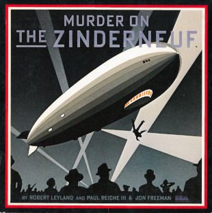
Murder on the Zinderneuf (Electronic Arts, 1983)
| Arriving in 1983 for Apple II, Commodore 64, Atari 800, and MS-DOS, it can be forgiven that Murder on the Zinderneuf didn't look like much graphically. But what this game lacks in pixel prowess, it more than makes up for with its awesome cover. The zeppelin, searchlights, and the alarmed crowd irresistably remind us of the Hindenburg disaster in the 1930's. The pachaging used by Electronic Arts at the time (a cardboard folder slightly smaller than a vinyl 7" single-play record sleeve, but larger than most computer game boxes) helps nicely. |
|
 |
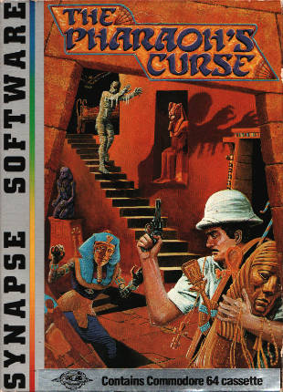
The Pharaoh's Curse (Synapse, 1983)
Synapse published some of the best-known games of the early eighties. Blue Max, Fort Apocalypse, and Drelbs are some famous examples. There is one lesser known title that came with startling cover art. The Pharaoh's Curse shows us the interior of (one supposes) a pyramid, with a grave robber who is confronted by an undead Egyptian and a mummy that impersonates Boris Karloff. Why, it looks as if it's straight from a 1920s or 1930s movie poster!
The game exists in versions for Atari 8-bit, Commodore VIC-20, and Commodore 64. Like many Synapse titles it is not abundant on the present-day second hand market. |
|
 |
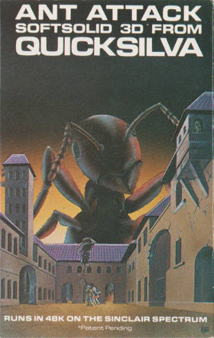
Ant Attack (Quicksilva, 1983)
Ant Attack is an early isometric game that takes place in a city run by ants. The object is to rescue one's girlfriend or boyfriend (the player would choose his or her own gender at the start of the game, which was unusual for the time) from the insects, which is in fact quite difficult to do. The buildings in the city are both a help and a hindrance when trying to outsmart or outrun the ants.
The cover depicts the city, with a giant ant towering over the buildings; this conveys the urgency that accompanies so many arcade titles. It is effective enough: I am convinced that I would not stick around that place very long if I were the (human) protagonist there. The image shown is of the Spectrum version. The C64 cover is based on the same image, but just a bit less effectively rendered as a consequence of typographical litter. |
|
 |
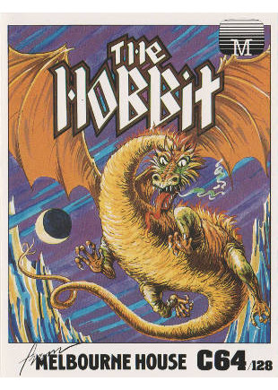
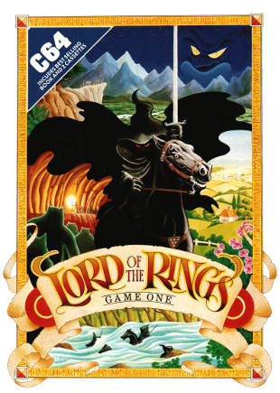
The Hobbit / The Lord of the Rings (Melbourne House, 1983, 1985)
Text adventures adapted from existing books, especially as popular as the Hobbit or the Lord of the Rings, are at a particular disadvantage. The original story and dialogues are fixed, and the images that the reader has formed in his mind's eye are as diverse as the readers themselves and there's no way to match them all. The Hobbit by Melbourne House is an interesting attempt. The non-player characters in the game have a certain will of their own; Thorin and Gandalf may not agree with the player's wishes and wander off on their own, making the game different each time it is played.
The Fellowship of the Ring does not possess this liveliness, but what it does share with the earlier game is awesome cover art. Both illustrations show scenes from their respective source material; the Smaug that descends wrathfully on Lake Town shows a great similarity with Tolkien's own drawing of the fearsome dragon. Unless your name is Bard and you are good with bows and arrows and such, you might have a bad day. The second image is just as interesting; the black rider in the center is as menacing as he should be, and the imagery around him is instantly recognizable and as theatrical as the classic Star Wars movie posters.
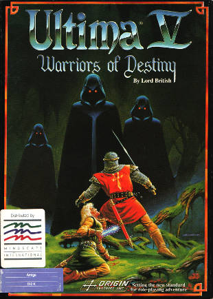
Ultima V (Origin, 1988)
YIKES. That is what I thought when I first saw the advertisement for this game in a magazine. The three cloaked figures with the luminous eyes (later I learned that these are called Shadowlords) are among the more sinister beings found in computer gamedom. Worse, they are in fact as unfriendly as they seem and are quite tall, which reduces any remaining cudliness to zero.
By the time Ultima V came out, the 8-bit world was beginning to make way for the next generation of 16-bit machines. Nevertheless, the game was originally developed on the Apple II and ported to that other very popular 8-bit platform, the Commodore 64, next to a bunch of 16-bit machines. Sadly, Ultima games have become stupidly expensive in the last 10 years. |
|
 |
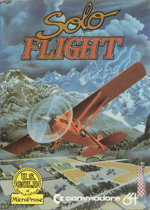
Solo Flight (Microprose, 1983)
My all-time number one. Solo Flight by Sid Meier (of Civilization fame) is an early flight simulator that came out on Atari 8-bit first, followed by C64, Apple II, and IBM PC versions. To call this title a game is probably somewhat inaccurate, as it actually has features appropriate to a simulator: approach circuits, instrument flying, and crosswinds for example.
The artwork by David Martin is perfectly atmospheric, with a dramatically climbing and turning aircraft — looking very much like Charles Lindbergh's famous Spirit of St. Louis — against a backdrop of lightning-stricken mountains. Makes me glad I'm indoors. It's a pity that the viewing angle is so narrow, but what a great picture. |
|
 |
(Originally written 2019/02/18)
Back
|

